Top 5 well-known brands that underwent a rebranding
It’s always dangerous to switch brands. However, many successful examples of businesses have made the change. Take a look at these successful rebranding initiatives for some ideas if you’re on the market about whether or not to undertake a rebranding effort for your own company. You have discovered the ideal place to keep your brand fresh and vibrant, reimagine your company after a setback, or simply upgrade.
To keep you motivated and provide new ideas for your own marketing makeover, we have compiled a list of five of the most talked-about rebrands. Can you guess how well they performed?
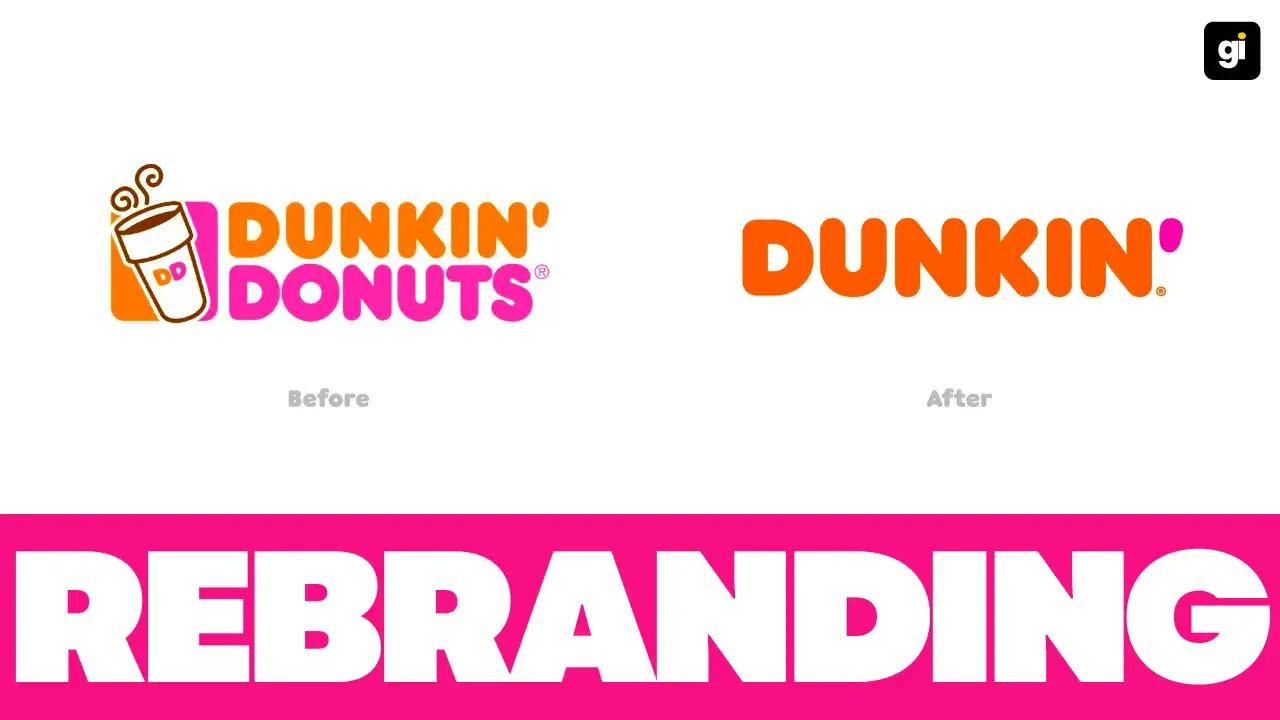
1. Dunkin Donuts to Dunkin’
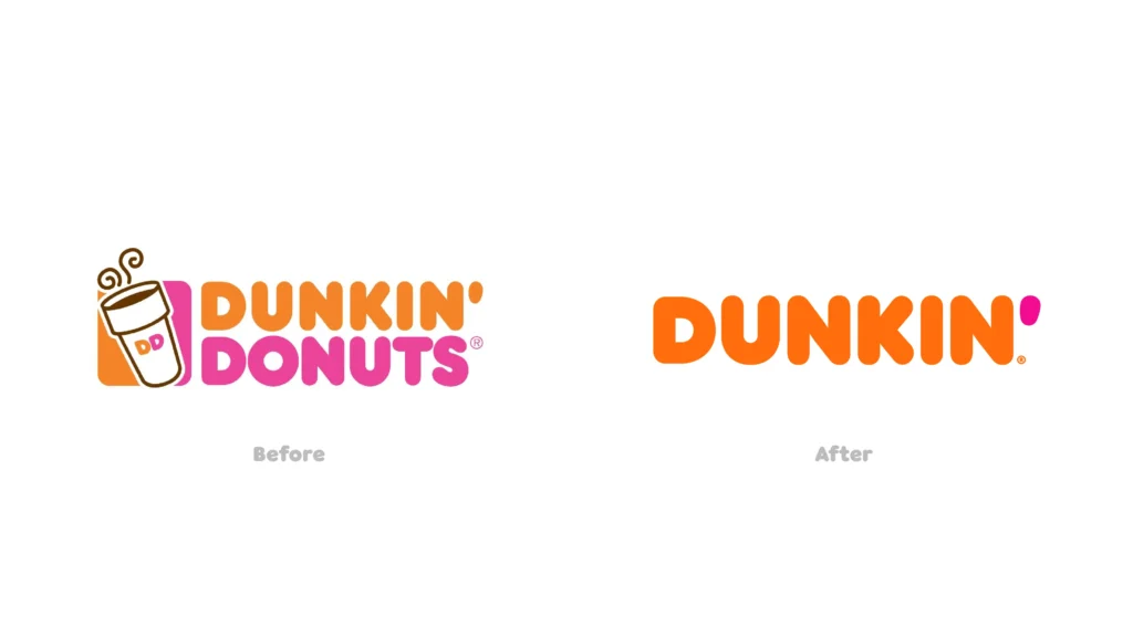
Despite the fact that “America Runs on Dunkin” has become a household term because of the chain’s popular donuts, Dunkin has officially eliminated the – Donuts from its name.
While this isn’t the first time the logo has been updated, eliminating the middle portion of the brand’s name is a significant modification.
In addition to a new name, the company also updated its logo, packaging, shop design, and brand messaging.
2. Indeed
The company’s logo has not been updated or changed. They did not change anything but instead accomplished far more.
The company’s logo is minimalistic, distinctive, and easy to remember. Moreover, they would have lost money by attempting to remake their image. It only made the brand more adaptable, exciting, and memorable in the meantime. For a more modern and attractive look, they updated their website and overall branding strategy.
3. Sprite
To better connect with and appeal to Generation Z consumers, Coca-Cola this year launched a global rebranding effort for its lemon-lime beverage Sprite.
Sprite’s ‘Heat Happens’ ad campaign is based on the idea that today’s youth are growing up in a competitive world where any minor argument may quickly escalate.
Though this certainly applies to the intense emotion of any heated debate, it also applies to the literal sweat that pours off your body during a heated disagreement, which Sprite has long been known to cool down.
The classic yellows and greens were kept for them. The starburst that formerly surrounded the name has been removed, bringing the label’s focus completely on the name and the bottle’s flavors.
4. Toblerone
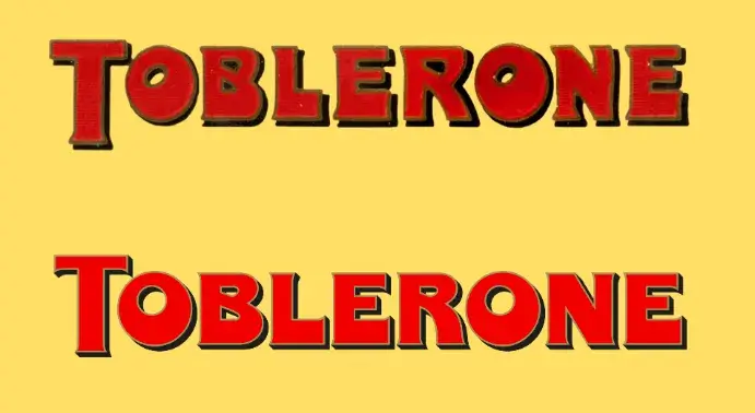
Earlier this year, the world’s most beloved chocolate, Toblerone, got a rebranding by Bulletproof Studio, giving it a bright new identity and font.
A more vibrant color design was applied in the rebrand, but the brand’s signature chamois, red, black, and gold were kept. As a result, the company has been able to update its image while staying faithful to its history.
5. Baskin Robbins
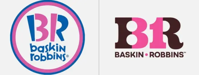
The company’s new logo is a throwback to its original, iconic design. Brown and pink, the actual colors of the brand, are used in the new one.
According to the old saying, – To grow up a little, one needs to get young; the founders of this mega-popular ice cream chain settled on the number 31 to represent the variety of flavors available each month.
To remain grounded no matter how far you may go is an attractive quality. Since color can profoundly affect one’s disposition, it’s become clear that it’s crucial to consider it when creating a logo.
In Closing
Following logo design trends is an excellent way to observe what the competition is doing, but going against the grain might help you identify new branding ideas. Logo generators are helpful for brainstorming, but professionals should handle the rebranding.
Your logo must match your brand’s visual design and personality to retain brand validity and awareness.
Table of Contents